Agrio

Agrio is a user-friendly app that harnesses the power of AI with computer vision capabilities to identify crop anomalies and provide knowledge on various techniques for treating the problems. The app empowers farmers and inspectors to optimize farming practices aimed to increase yields and crop quality in a sustainable way.

The Details
YEAR
2019
TYPE
Mobile App
ROLE
UX/UI, Website,
Marketing Design
Main Objective

Move the product from MVP to the next level.

BACKGROUND

Standing on the shoulders of giants.

When I got on board, the goal was to advance plant protection in emerging markets. Luckily at the time, the startup joined the Google Campus Residency program which provided us with exceptional workspace facilities, tailored mentorship and connections to the industry’s top experts. With limited resources and the support of Google for Startups Campus, we managed to establish a product that is used by thousands of users from all over the world.

Brainstorming at the Google for Startups Campus.
Inspectors

Inspectors can scout crops and rapidly produce reports using the image and speech recognition technology.

Farmers

The app enables farmers to instantly identify crop anomalies, give treatment recommendations, and alerts other users in the area.

Supervisors

User’s performance, trends and early warnings of issues are presented to supervisors to help them make long term decisions.

The vision

Become the standard of care in crop pathology.

The app was designed to help farmers diagnose crop irregularities by taking a photo, and an AI with computer vision capabilities identifies the plant, identifies the anomaly, and provides concrete recommendations.
The instructions on how to treat the plant are backed by each nation’s agriculture ministry. The app also alerts other users in the same area on outbreaks of local epidemics and informs them about preventive measures.

In addition to farmers, organizations also use the app. This required me, as the designer, to include the needs of supervisors and inspectors, to anticipate the questions each user might have, and provide each type of user with relevant and suitable information.

Understanding The Problem

The state of global food security is alarming.

There is a growingly negative imbalance between the increasing demand of the world's population and the global agricultural output. Part of the problem is loss of crops in developing countries due to lack of diagnostic and immediate services regarding plant diseases.

Plant Protection

Plant protection has an important role to play in dealing with this challenge. 20 to 40 percent of global agricultural output is lost due to pathogens, animals and weeds. The cost of crop losses is astronomical and affects farmers, companies, consumers, public health, the economy and the environment.

Developing Economies

In developing countries, this problem is a result of multiple reasons: lack of inspectors and agronomists often leads to bad practices and misuse of chemicals, lack of tools that can manage smallholder farmers’ organizations, and limited infrastructure necessary for effectively manage disease and pest epidemics which happen more frequently due to climate change.

Deforestation

As a result of the growing demand, more forestland is replaced by farmland which only extends the crisis. To be able to responsibly feed the growing population of the world, it is critical that farmers increase food production on existing farmland instead of the growing trend of deforestation.

On my visit in a local farm in Indonesia

Field Research

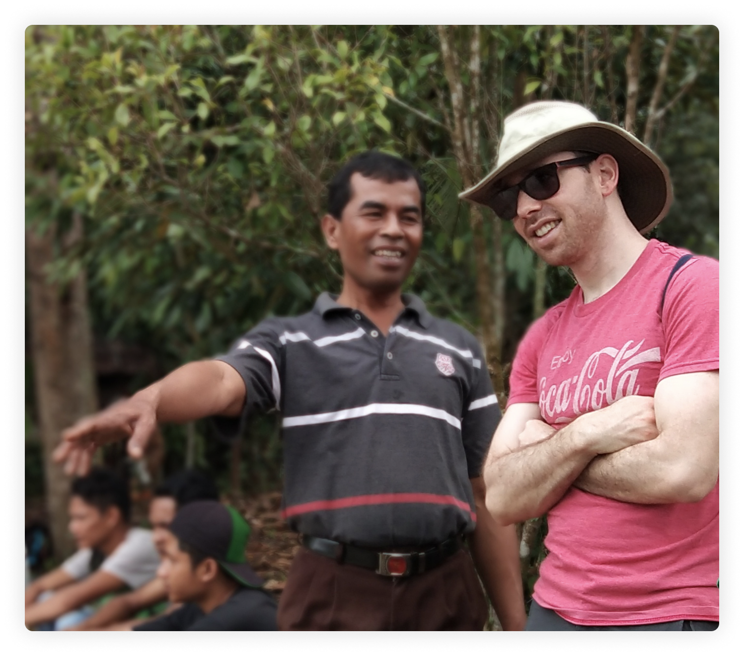
Since most of the potential app users work outside on the field on a daily basis, conducting field research was the best way to gain holistic perspectives on their needs. We chose to focus on Indonesia as a case study.

Research Study Document

Before embarking on the trip to Indonesia I created a document describing the trip (dates, location and overall purpose of the trip). The document also included the primary research questions, broken into themes and prioritized.

Discovery

I stayed at the farmers' homes and joined them on their daily routine, during which I observed and interviewed them. I created user profiles and user journeys of their everyday practices. Additionally, I took hundreds of photos. The purpose was to compare the existing user's pain and struggles with our assumptions and to gain insights into new pains, new paths and new behaviors.

Define

After collecting all the data from the field, it was time to make sense of it. I copied all the interview data onto sticky notes, one quote or observation per note. The purpose of breaking down the information was to ease the process of communicating the findings to the rest of the team in an aim to gain insights.

Not all problems need to be addressed via the app. What we were trying to do is identify the root cause of the pivotal problems and to provide solutions for the most common symptoms. Once the core problems were more comprehensible, the team and I ran a Design Sprint to clearly define goals, validate assumptions, prioritize and decide on a product roadmap before starting development

Crazy 8’s exercise.
Branding

Branding is a process that takes time and resources.

Due to lack of resources the branding process had to be shortened. The basic visual line has been established by another designer in a preliminary stage before I joined the company. Because time was of the essence, we decided to keep the existing basic style and build on top of that.

Branding Session

I ran a quick branding session with the team to make sure that we were in the right direction. The team and I established four core words that we wanted to be associated with and for each core value I created a mood board.

Colors

Green was an obvious choice as the main color to reflect agriculture and growth. Royal blue complements the green and reflects trust responsibility and technology. As a third color I added sky blue which mainly appears in the background of the illustrations to bring joy and draw attention to them.

Logomark

Another critical part of the branding was to design the app’s icon. The icon had to stick out from the other agriculture apps on the store but at the same time communicate what we do universally. The symbols of a leaf and fields seemed to be simple shapes that can be easily recognizable globally and work in every size.

Illustrations

The app is used by users from all around the world, although it is translated into 17 languages, we may still have users that struggle to understand the written text in their own language. The illustrations capture the users’ attention and highlight important information but it’s also an opportunity to give the user a clue as to what they should do and maybe even get them excited about it.

The illustrations humanize the brand and generate a welcoming atmosphere that strengthen the product’s amicability. In this case, I used flat, colorful, geometric shapes in the illustrations to communicate that the app is simple, relatable, friendly and easy to understand.

Final Design

Identification & Recommendation

Images of the plants are uploaded to the app then analyzed through the artificial intelligence algorithms. The system provides users with identifications and suggested solutions.

Alert System

The system notifies subscribers as soon as crop diseases and pests are detected in their area. The alerts come with written preventative measures to aid in impeding infestations.

Reports

Inspectors can collaborate with colleagues to manage plots. Quickly generate and share scouting notes using speech-to-text technology and track progress with the rest of the team.

Impact

In just a few months we managed to take an initial product and turn it into a full blown app that was featured in the Google Play Store with 4.5 stars rating and over 100K downloads.